

Research we did as a class which looks at keywords, key images, and existing logos in that particular market.

1st draft sketches showing my ideas from castles, to modern symbols. Also my experimentation of negative space in the shield and squares.
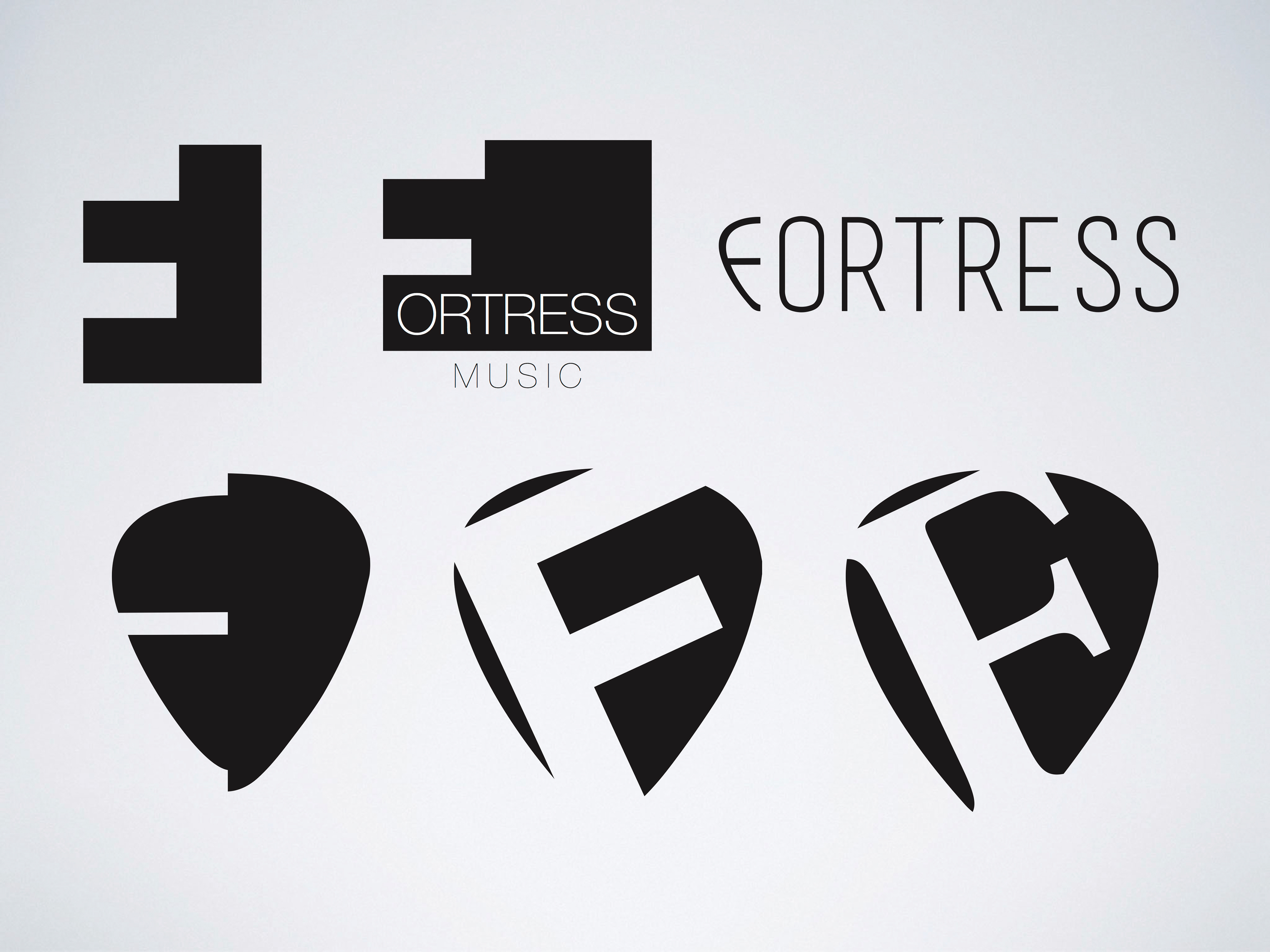
These are the first ideas I computerised. They comprise of the plectrum being used as the main mark.

I then moved on to using the shield as the main idea. Using the 'F' in various different ways.
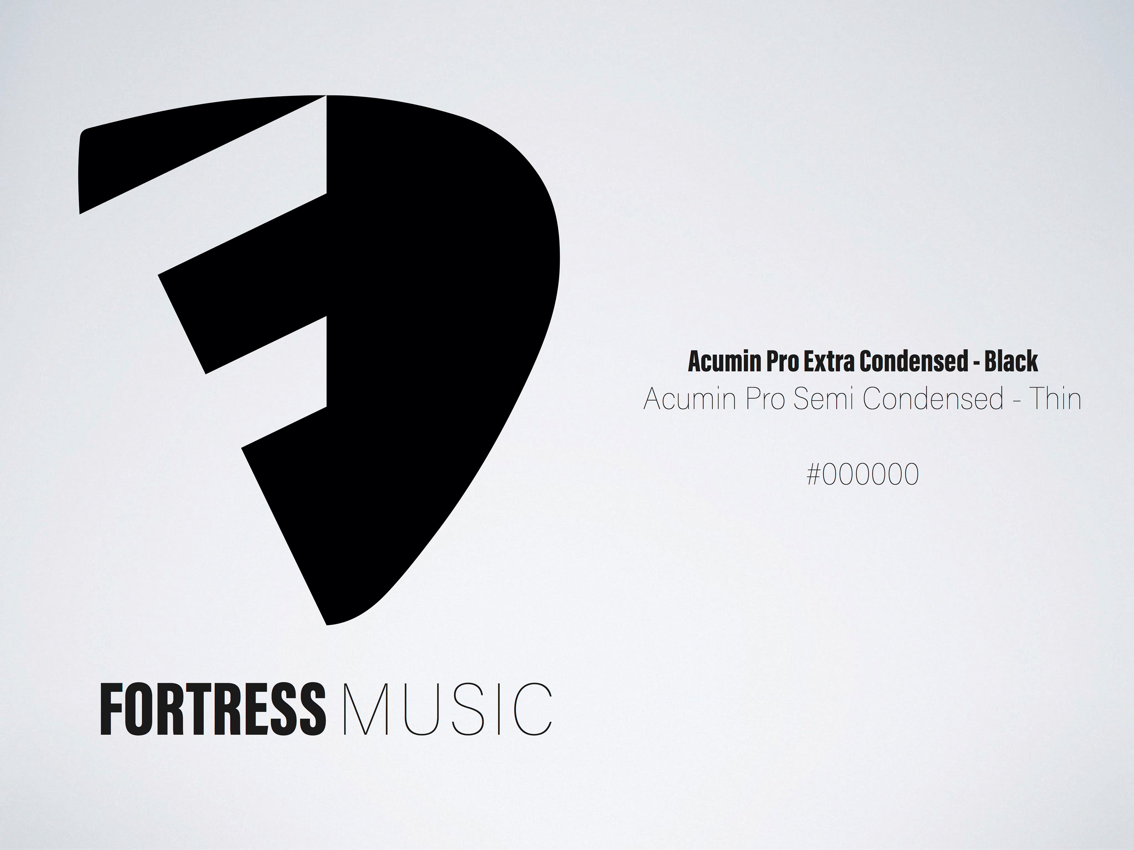
This is the final logo I presented to 'Fortress Music'. The idea uses a half-half method, and it consists of the left part being a shield with the 'F' used as negative space, and the other half being a plectrum, linking it to the music industry.
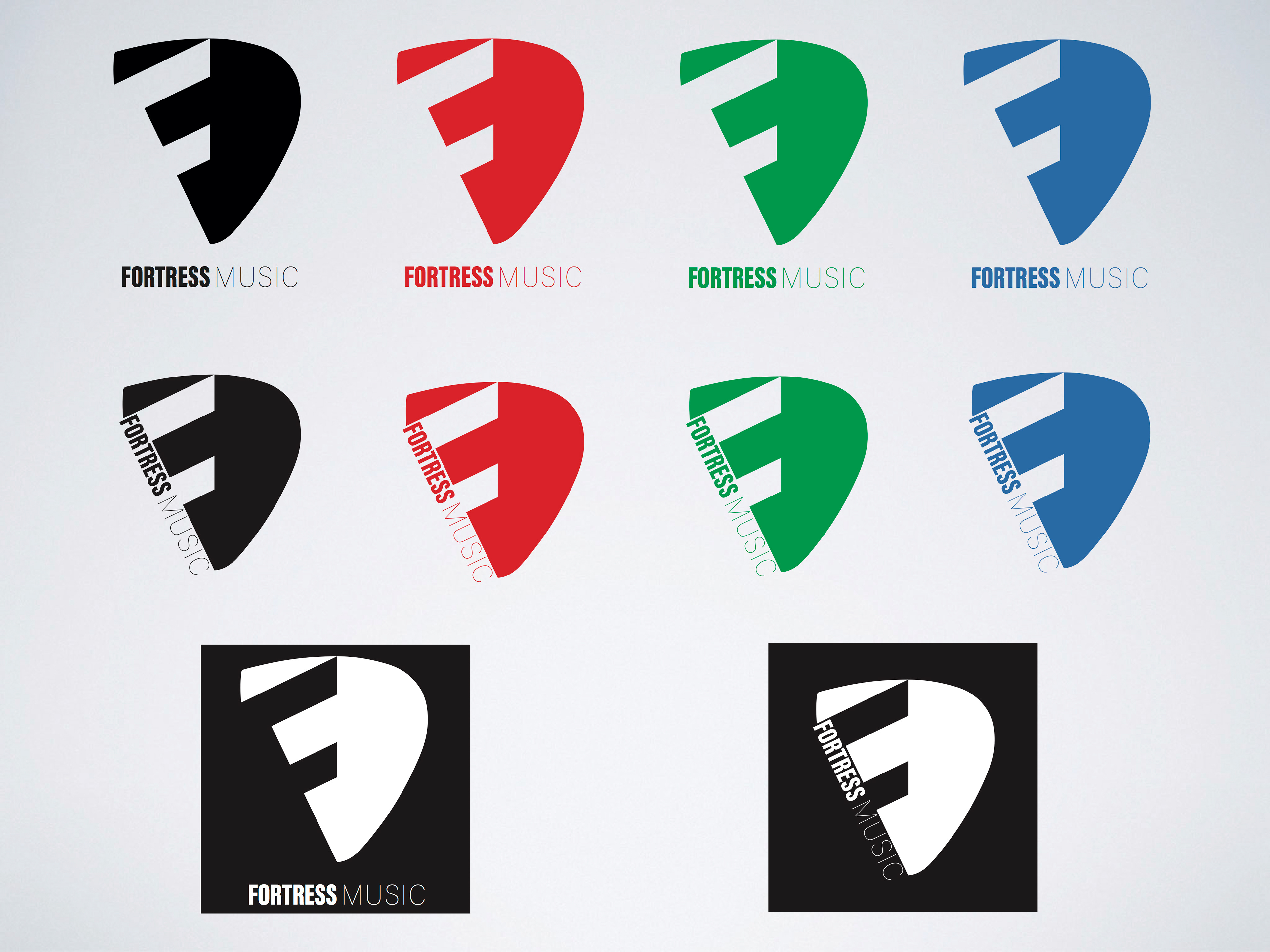
These are all the variations of the mark, using it with different colours. I even added in an extra layout of the logo, which incorporates the name of the company down the left hand side of the 'F'.
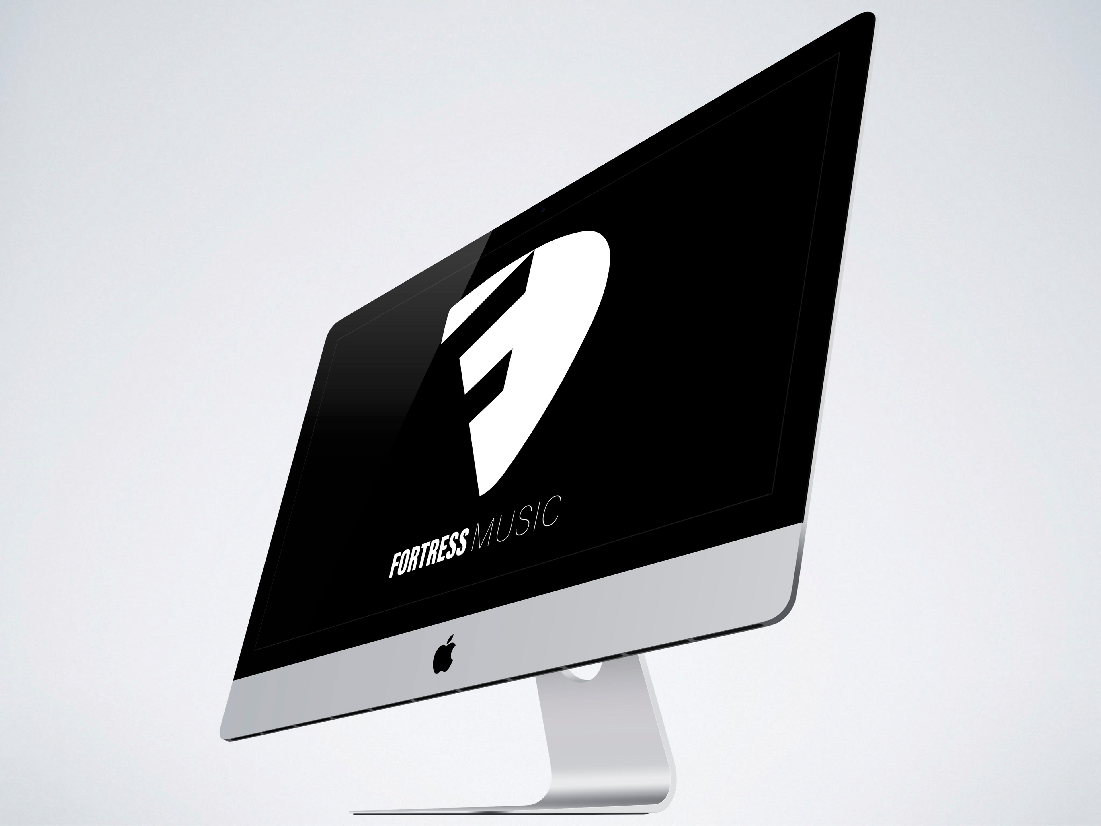
Here is the logo being used as a wallpaper/screensaver.
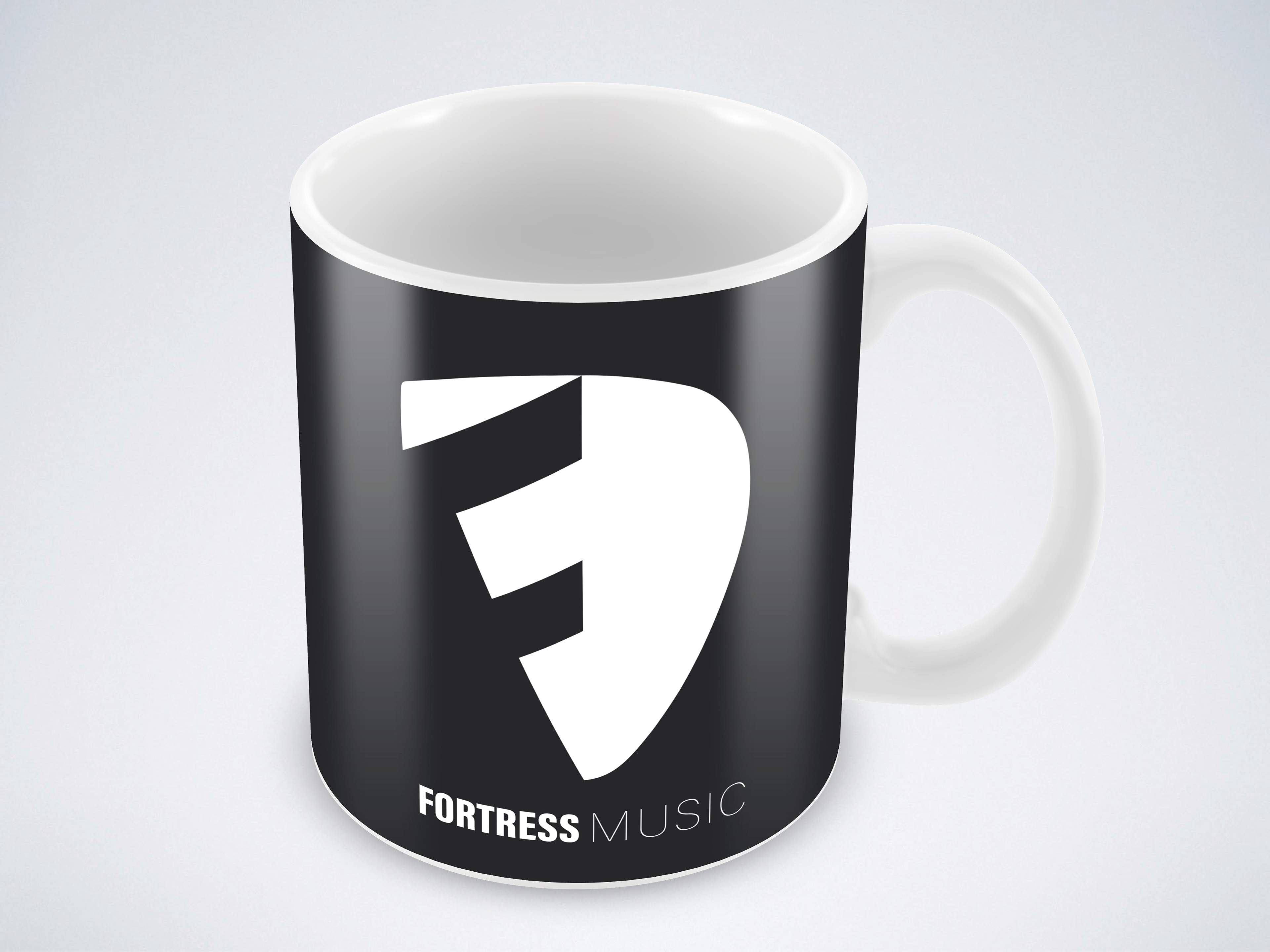
And again on a mug.

Also on a gift bag.

And finally, here it is on a t-shirt.